I haven't reviewed issue one because, while I bought it, I lost the copy! Where it went...
Anyway here's a quick recap. Issue one saw multiple sclerosis sufferer Simon Pooni granted a wish by Ormon, a talking monkey in spacesuit. The last talking monkey I saw was in Grant Morrison's The Filth - and a foul-mouthed simian he was! Simon's illness has left him wheelchair-bound with his parents having to help bathe and feed him - terribly embarrassing for a budding teenager. Simon is also bullied and spends most of his free time immersing himself in movies. All pretty standard stuff but let's face it, anything with a talking monkey instantly elevates the story to comic book gold! Simon's wish? To become Superior - the superhero star of the Superior movie franchise played by actor Tad Scott. Wah-lah! The monkey grants Simon's wish. This has echoes of Captain Marvel/Billy Batson and smells of adolescent power fantasy. Well, really, which superhero comics aren't adolescent power fantasies... None of it's subtle but Millar doesn't do subtle.
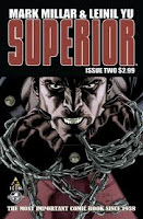
Issue two sees Superior/Simon convincing his friend, Chris, that he's actually Simon in Superior's body. Thankfully we're spared the "I'll tell you something that only you and I know" scene. They test out Superior's super abilities to see if they're the same as the Superior movie character version or the comic book version - some pretty standard "new superhero learns how to use their abilities" stuff, but at least a little amusing. Simon uses his frustration of living with multiple sclerosis to fuel the control of his new powers. The climax sees Superior confronted with his first major disaster. There's also a hint that Simon may not be Superior forever.

As I've come to expect from Millar the story jumps along at a nice clip but like Nemesis I feel that Millar is delivering only just enough per issue. This issue could've been told in half the pages which means we could have double the amount of story! Do we really need half page splashes of Simon/Superior learning to fly? Or him learning to use his supervision?
The issue's high point is Leinil Yu's realistic styled artwork. Each panel is meticulously drawn and striking really producing a big look.
The one thing that was disappointing was the comic's colouring, especially on Superior's face. It just looks heavy-handed at best, amateurish at worst, and takes away from Yu's fine pencil work. Pages with just Yu's pencils are reproduced in the back of the issue showing the detailed and crisp line work.The colouring really obliterates this detail. I'm assuming the colouring has been done digitally I've found this on any number of occasions in comics. It used to be worse, especially in the 1990s when the use of computers and digital imaging was just beginning. Thankfully proficiency and programs have improved but like anything it can be done badly and here, I think it is. I sometimes think that I'd prefer to see the comic printed just as pencils without the coloring.
If there's one other small criticism, while Yu's work is fantastic, the poses Superior strikes are still in the vein of superheroic. There's less conveyance of a young goofy boy in a hulking unfamiliar body. Nothing like how Frank Quitely brilliantly managed to pull off making Clark Kent look completely different, and actually hold his body different, to Superman in All-Star Superman.
Superior #2 is entertaining enough and is setting up the longer story nicely. Millar is one of the superstars of comic writing at the moment and it's easy to see why. He's developed a distinct style in his storytelling - bold in style, big in concept. Millar produces a spectacle, leaving lots of room for his artist to work. Still, I just wish there was more...
This: Solid and interesting
Forthcoming: Why not? Talking monkeys (and ones that grant wishes) are always a drawcard. Let's see where it's going...
Read review of Superior #3

Apprecciate this blog post
ReplyDelete